-2-3.png)
Insights from Fat Baby Marketing's creative design partner, Vara, on the power of typography.
Typography is one of those branding elements that does enormous work quietly.
Most people can tell when a brand feels trustworthy, sophisticated, approachable, or innovative. What they often can't tell is why. One of the biggest contributors is typography.
We sat down with our designer Vara to unpack what's really happening when a brand chooses its fonts, and why it matters more than most people realize.
meet vara
Vara is a creative design partner at Fat Baby Marketing, specializing in brand identity, visual systems, and creative strategy. She works closely with clients to build brands that not only look beautiful but communicate the right message to the right audience.
One of the first things Vara shared with us was that people don’t need to consciously notice typography for it to affect them.
“Most people aren’t consciously analyzing typography, but they’re absolutely feeling it.”
According to Vara, fonts function much like tone of voice or body language. Consumers may not actively evaluate the typography in front of them, but they respond to the emotions and impressions it creates all the same.
In other words, your fonts are talking before you do.
typography shapes first impressions
When we asked Vara why typography matters so much in branding, her answer had less to do with aesthetics and more to do with perception.
“Typography is really emotional architecture.”
She explained that every typeface carries associations built through history, culture, and repeated exposure. Over time, people develop expectations around type styles based on where and how they’ve encountered them.
Serif fonts are commonly associated with publishing, academia, and financial institutions, which is why they tend to read as established, trustworthy, and refined. Sans serif fonts became closely tied to modernism and technology, making them a natural fit for brands that want to feel clean and contemporary. Script fonts carry a sense of personality and craftsmanship because of their connection to handwriting.
great typography goes beyond personal preference
Most companies choose fonts based on what they personally like. Vara encourages clients to take a different approach.
“The question shouldn’t just be ‘Do I like this font?’ It should be ‘Does this font make people feel what the brand is trying to communicate?’”
A typeface can be visually appealing and still create a disconnect. If it communicates the wrong emotional tone, it works against the brand rather than for it.
A bubbly, playful font on a law firm’s website undermines the trust and authority that audience is looking for. A rigid, corporate typeface on a wellness brand can make it feel cold when it should feel warm.
Typography should align with your brand, reinforcing its personality, values, and positioning.
what does a designer's process actually look like?
“Typography selection starts long before I actually begin choosing fonts.”
Choosing typography isn’t about scrolling through a font library until something looks nice. Before exploring typefaces, Vara focuses on understanding the business itself—its audience, goals, positioning, and the emotional response the brand should create. That foundation shapes every design decision that follows.
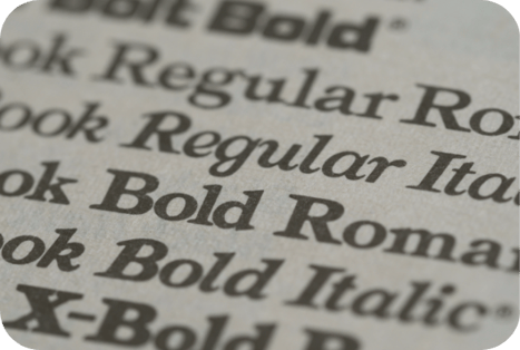
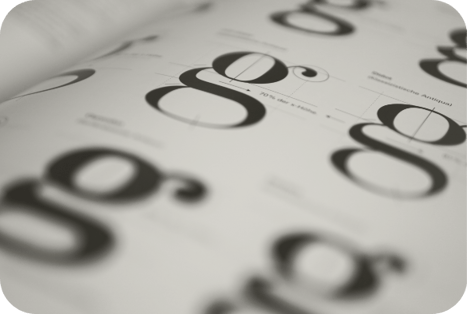
From there, the process becomes highly detailed. Vara often creates typography studies containing hundreds of potential options.
Hundreds.
She compares subtle differences in structure, spacing, proportions, curves, and overall energy. Those differences may seem minor at first glance, but they can significantly shift how a brand feels.
Effective brands rely on multiple type styles working together across websites, social media, presentations, packaging, and every other customer touchpoint.
“Typography only becomes powerful when it’s part of a larger system.”
The goal is to create a cohesive visual experience that helps customers recognize and trust the brand over time and across platforms.
typography mistakes brands make
After hearing about the amount of strategy that goes into selecting typography, we had to ask: where do brands most commonly get it wrong?
According to Vara, the biggest issues often aren't the fonts themselves. They're the systems, or lack thereof, behind them.
“One of the biggest mistakes I see is a lack of typographic hierarchy. It's one of those details people may not consciously notice, but they absolutely feel when it's missing.”
According to Vara, typography should help guide readers through information in a clear and intentional way. Headings, subheadings, body copy, captions, and callouts should each serve a distinct purpose within the overall system.
When everything looks visually equal, readers don't know where to focus first. The content begins to feel cluttered, even if they can't immediately explain why.
“Good hierarchy creates rhythm. It controls pacing, attention, and clarity.”
Another issue Vara frequently encounters is inconsistency.
Brands often use different fonts, spacing styles, or type weights across websites, social media, presentations, and marketing materials without a clear system in place. Over time, those inconsistencies weaken recognition and make the brand feel fragmented.
For Vara, these challenges reinforce an important point:
“Typography is not just decoration. It's communication structure.”
When used intentionally, typography helps shape how people absorb information, interpret personality, and emotionally connect with a brand.
final thoughts
When typography is done well, it looks effortless. Customers may never consciously notice the spacing between letters or the subtle distinctions between typefaces. But whether people realize it or not, fonts are always saying something.
The question is: what are they saying about your brand?